The room journal
Restaurant furniture sightlines from the entrance to the dining room
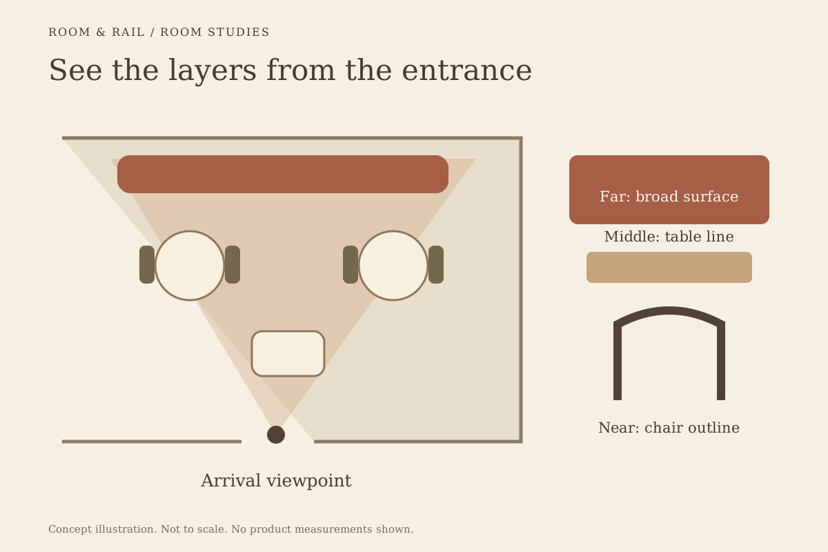
Restaurant furniture sightlines begin before a guest reaches a table. From the entrance, chair backs, tabletops, and booth ends overlap into one view. A selection that looks balanced as separate product images can feel quite different when those pieces are layered across the room.
Study that first view early, then compare it with the views from the seats themselves. The aim is to decide what should attract attention, what should remain quieter, and which furniture details are actually visible. This gives the palette a clearer purpose than arranging attractive images on a board without a room around them.
Open diagram at full size (new tab) ↗
Choose the views that explain the restaurant
Start with a small set of real positions: the arrival point, the route into the dining area, and a seat facing the most prominent feature. Add another position only when it reveals a different relationship. Too many views can make the review less focused.
Photograph the existing room if you have access, or mark the positions on the current drawing. Keep the camera viewpoint consistent when comparing alternatives. A change in viewpoint can make a furniture revision appear more effective than it is.
The room-planning page distinguishes this visual work from the measured layout review. A sightline sketch cannot establish safe circulation, accessibility, or permitted capacity. Use it to judge what the room reveals, with the relevant professional checks handled through the actual plan.
Identify the first strong shape
In each view, note which piece occupies the clearest area of the scene. It might be the end of a booth, the back of a chair, or the surface of a communal table. That piece may need a more deliberate finish choice than furniture partly hidden behind it.
Look for the background immediately around the shape. A dark frame can be distinct against a pale wall and less distinct against a dark bar front. The same product may therefore contribute differently in two positions within the restaurant.
Use simple shaded blocks before adding detailed textures to the study. This helps separate the broad composition from the attraction of a particular upholstery or wood grain. If the view is unclear in plain shapes, a more elaborate palette may not resolve it.
Read the furniture in layers
The nearest chair, the table behind it, and the booth across the room occupy different layers of the view. Their details can overlap. A row of chair rails may sit in front of patterned upholstery, while table edges create another horizontal band between them.
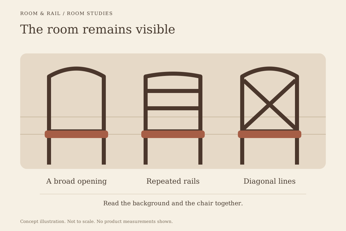
Compare the chair silhouettes with the objects that will appear behind them. Open frames reveal more of those objects; broader backs introduce their own surface. The guide to open-back restaurant chairs looks specifically at how those openings change the composition.
At the lower level, table bases and chair legs may be visible against the floor. Do not leave that part of the scene blank in every board. A strong finish below the tabletop can change the room even when the larger surfaces stay neutral.
Decide where detail should gather
A restaurant can contain several patterns without giving each one equal emphasis. You might concentrate detail at the bar and use calmer furniture nearby, or let a booth carry the strongest texture while the tables remain restrained.
Review the scene in groups rather than asking whether each individual piece is too busy. A detailed bar stool can work beside a plain counter front but compete with an elaborate one. The surrounding objects determine how much room the detail has to be read.
Record the intended emphasis on the finish board. A note such as keep the entrance view focused on the curved booth gives later substitutions a test. Without that note, each replacement may add another attractive feature until the original emphasis is lost.
Check what the tables conceal
Tabletops hide parts of the seating and supports when seen from some positions. A carefully selected seat color may be less visible from the entrance than expected, while the chair back remains prominent. Move the review to a seated viewpoint before deciding that the color choice has failed.
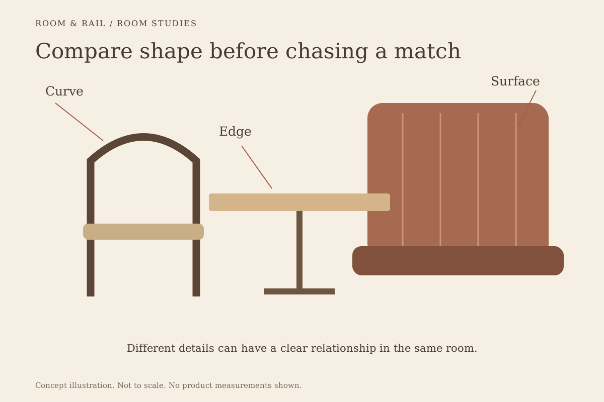
The table edge guide explains why the perimeter can become a stronger feature than the top surface. Use an angled or side reference when available, and retain the listed dimensions. Photographs should help explain the product, not substitute for measurements.
If the view depends on a specific arm, back, or table height, request the missing dimension rather than scaling a catalog image. Perspective can distort apparent relationships. Keep the unresolved detail beside the affected product so it remains visible during the next review.
Study the room from a guest's seat
Once seated, guests may look toward a neighboring table, the service counter, or an exterior view. Furniture that seems minor from the entrance can fill more of this closer scene. Review the back of the opposite chair and the surface behind it together.
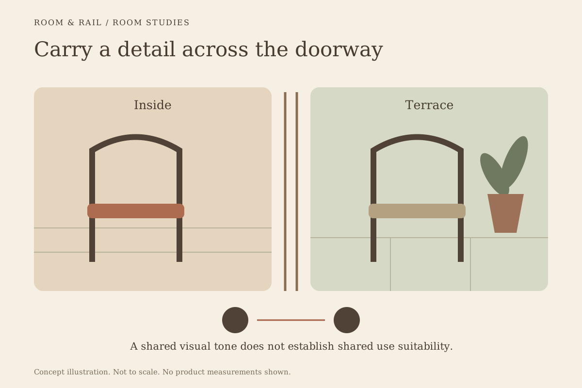
Where windows connect the restaurant to a patio, include the exterior furniture in the study. The guide to indoor and outdoor palettes shows how one repeated shape or tone can connect those areas without requiring the same products.
Retain variety between the views. Every seat does not need to face the same focal object, and every furniture piece does not need to announce itself. The useful outcome is a set of considered relationships that make sense from the positions people actually occupy.
Keep alternatives comparable
Create separate board versions for genuinely different compositions. Use the same room names and quantities while comparing the visual direction, unless the layout itself is changing. This prevents a fuller board from seeming more convincing simply because it contains more pieces.
The finish-board guide explains how selected configurations and saved references stay together. Add a short description of the viewpoint being reviewed. A colleague can then understand why one chair back matters more in the entrance image than another finish elsewhere.
Leave a readable path through the view
At the final review, return to the first arrival position and describe what the eye meets in plain language. If the explanation depends on a long list of competing details, simplify one relationship and compare again. The shape and proportion guide can help identify a smaller change than replacing the whole scheme.
Save the selected composition with its viewpoints and unresolved measurement questions. Those notes make the next revision more precise. The furniture board becomes a record of how the room is meant to be seen, rather than a collection of products whose relationship must be reconstructed each time.