The room journal
Compare restaurant furniture shapes, materials and proportions
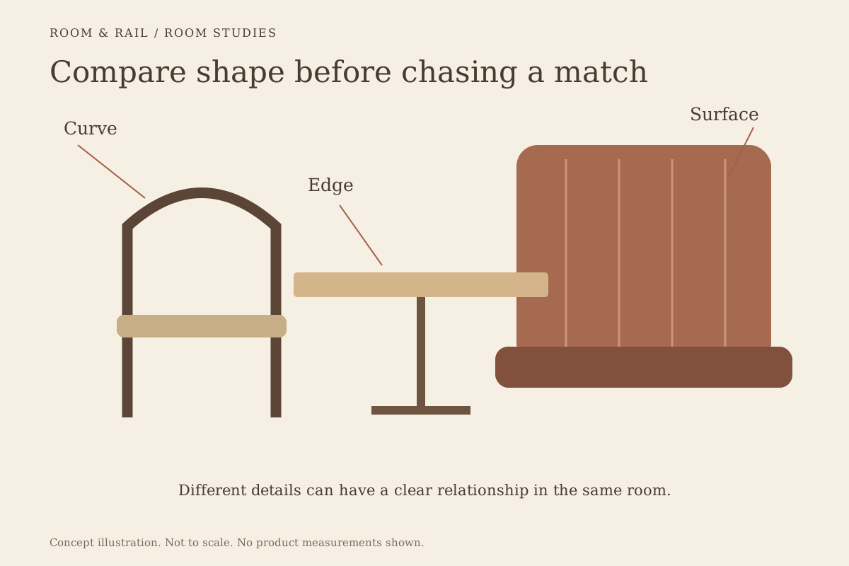
A restaurant room can contain different furniture pieces and still feel considered. The connection may come from a repeated line, a related material or the way each piece sits beside the next. Choosing that relationship is more useful than trying to match every surface by name.
Begin with the room you have, including the finishes that will stay. Then compare actual furniture references against that setting. A clear palette develops through a series of specific decisions, from the outline of a chair to the finish selected for its frame.
Open diagram at full size (new tab) ↗
Read the existing room before choosing a piece
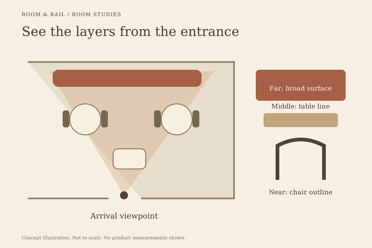
Note the floor, walls, lighting and fixed counters. These elements remain part of the visual composition even when the furniture is new. A wood floor, for example, is already a substantial material reference; another wood finish will be seen beside it rather than in isolation.
Keep a short set of notes about what should connect and what can differ. You might want a repeated dark frame across the dining area, or a lighter seat surface beside an existing table. Treat those notes as questions to test against actual products.
Use the collection directory to explore the main furniture types. Look across categories without assuming that every piece must come from the same named range. The visual relationship still needs to be checked against dimensions, stated materials and available configurations.
Start with the outline of the seating
A chair back can introduce horizontal rails, crossed lines, a plain panel or a woven pattern. Those details remain visible even when several models share a similar color. Read the silhouette before narrowing the choice to a finish.
Compare dining chairs at the product-page level, where the specifications sit beside the imagery. An armchair has a different outline and clearance question from a chair without arms. A swivel stool also needs movement to be considered in its placement.
For a bar area, open the bar stool selection separately. A visual connection to the dining chairs can be useful, but the seating height must suit the intended counter. Matching appearance does not settle that relationship.
Consider the table edge as part of the palette
The visible table surface is only one part of its appearance. The edge, thickness and support also meet the seating visually. Check the listed dimensions and construction before deciding how a top will sit beside the chairs.
Browse table surfaces and table bases with the intended pairing in mind. If they are separate products, confirm their compatibility. A similar finish or appealing photograph does not establish that the mounting arrangement works.
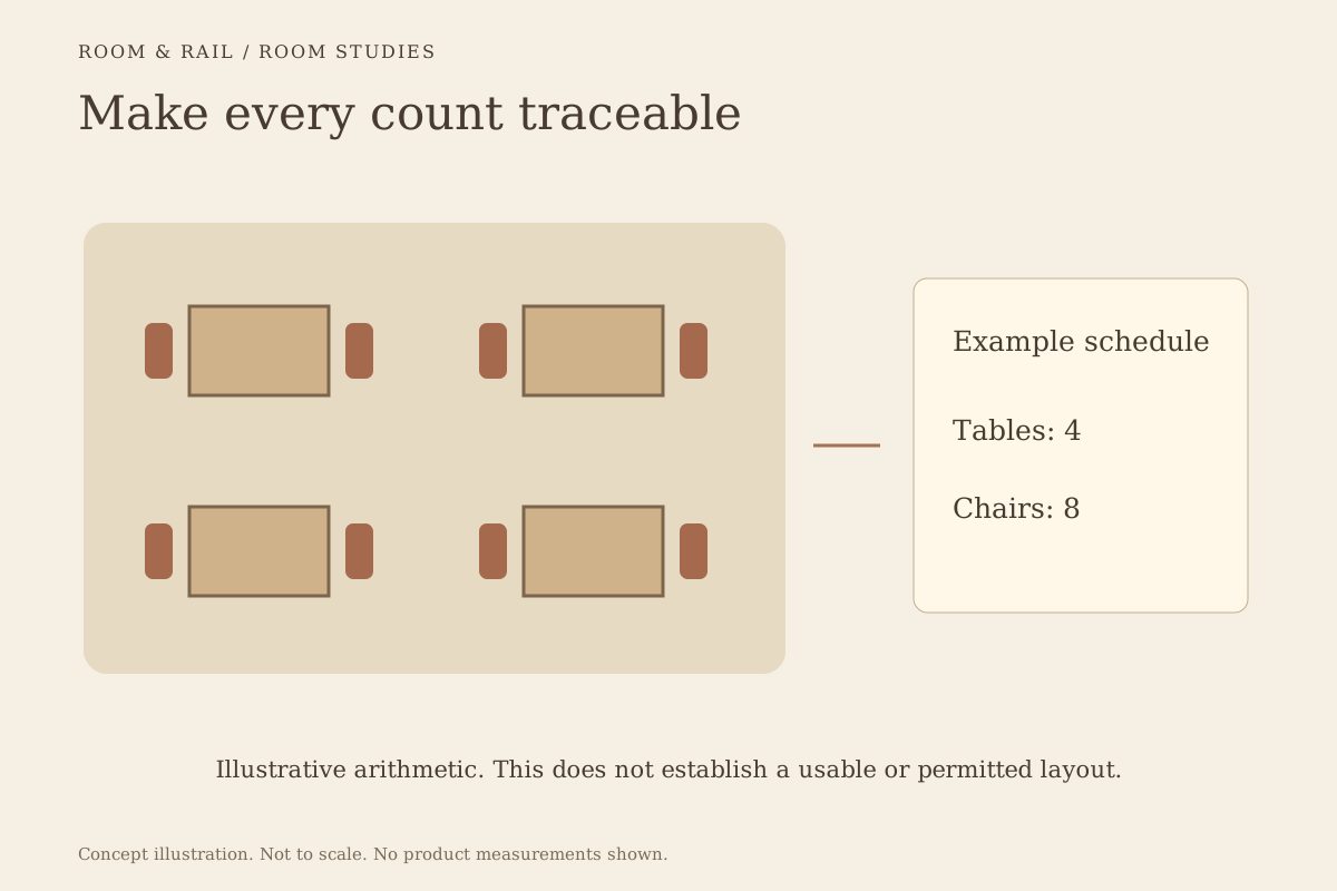
When choosing a complete table, read what is included and which options are available. Keep the actual selected size on the board so the visual idea does not lose its scale when it becomes a furniture schedule.
Give texture a deliberate role
A room can use a restrained set of colors while still having variety through texture. Woven seating, an upholstered back and a smooth tabletop create different surfaces for the eye to read. Consider those differences beside the fixed materials already in the space.
Use the stated product construction when describing the palette. A wood-like appearance does not by itself identify solid wood. A rattan-like weave or metallic color also needs its actual material description retained. The materials notes explain how to keep the reference precise.
Try to identify what each new surface contributes. If several strong patterns compete in the same zone, compare a simpler alternative before treating the first combination as settled. This is a visual decision to review in your room, not a claim that one style suits every restaurant.
Turn the palette into selected references
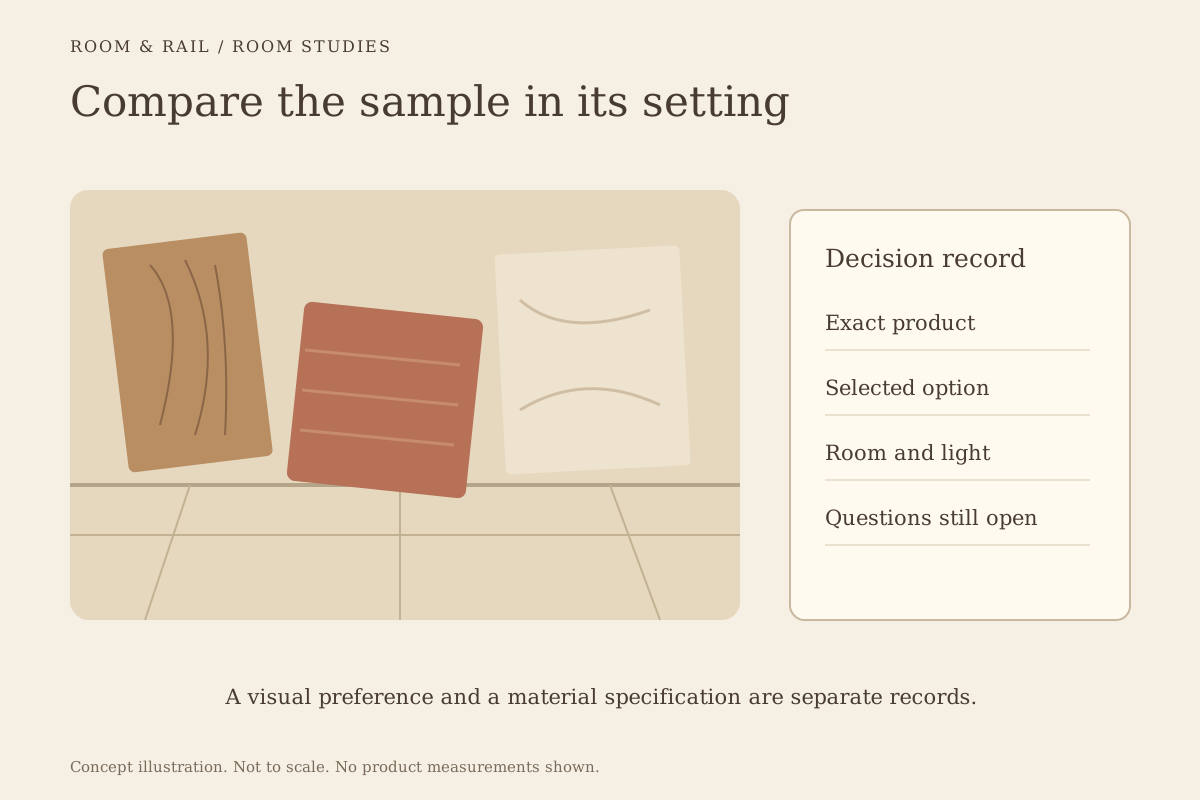
Complete the available controls for each product before saving it. The selected finish name and verified sample, where available, identify the version on the finish board. The main product photograph remains a representative view of the model.
Keep two finish alternatives on separate lines or separate project versions. If both are placed together without explanation, the board can look complete while leaving the actual choice unresolved. Quantities should describe the intended selection rather than every option being considered.
For a more detailed board workflow, read how to keep a restaurant finish board clear. The useful result is a reference someone else can read without guessing which finish belongs to which product.
Check proportion in the intended position
Compare the listed measurements with the table, counter and surrounding furniture. Look at arms beneath an apron, chair movement behind a table and the relationship between a stool seat and its counter. The room needs to work when people are using the furniture.
Do not estimate a missing measurement from the photograph. Perspective and camera angle can change the apparent proportions. Retain the model reference and ask for the dimension that matters to the pairing or layout.
Use room planning to group pieces by their intended area. A dining room and a patio can share a visual direction while needing different furniture classifications. Check the stated use of each product, including any covered patio restriction.
Review a room copy as a new composition
Duplicating a saved room carries its furniture, finishes and quantities into another group. That is useful when a second space begins with the same choices, but it does not settle whether the copied arrangement fits its proportions.
Rename the copy, check the count and compare it with the new room's fixed features. A different floor material, counter shape or amount of available space may change how the same furniture reads. Keep those observations in the project notes.
Save the revised board before downloading a project sheet. The document reflects the saved version, including its selected references and quantities. An earlier sheet remains a record of the earlier choices, so replace the shared reference when the direction changes.
Carry the selected room into the order review
Before moving the board into the basket, review current prices and options. Read the configuration labels beside the thumbnails and check the quantity for each room. A physical material match, missing dimension or delivery question should remain visible until confirmed.
Use delivery planning to connect the finished room with the route the furniture must take to reach it. Read how ordering works before sending the selection. This preview uses test orders while final business and fulfillment details are prepared.
A considered palette is more than a collection of attractive references. It explains how the actual selected pieces relate to the room, and it retains enough detail for the next person to understand that choice.
Keep the visual idea and the specification together as the project develops. When a finish or piece changes, revisit the neighboring choices too. The room becomes clearer when each revision is assessed as part of the whole composition.