The room journal
Cafe furniture that relates to the service counter
Cafe furniture is often seen in the same glance as the service counter. The chairs and tables may occupy most of the floor, but the counter brings a fixed shape, a material palette, and a strong horizontal line into the room. Treating those elements together can make a small selection feel much more deliberate.
Begin with what is already decided at the counter. Its front, work surface, display area, and nearby wall may provide enough visual character to guide the furniture. The task is to choose how the seating responds, rather than add another complete design language beside it.
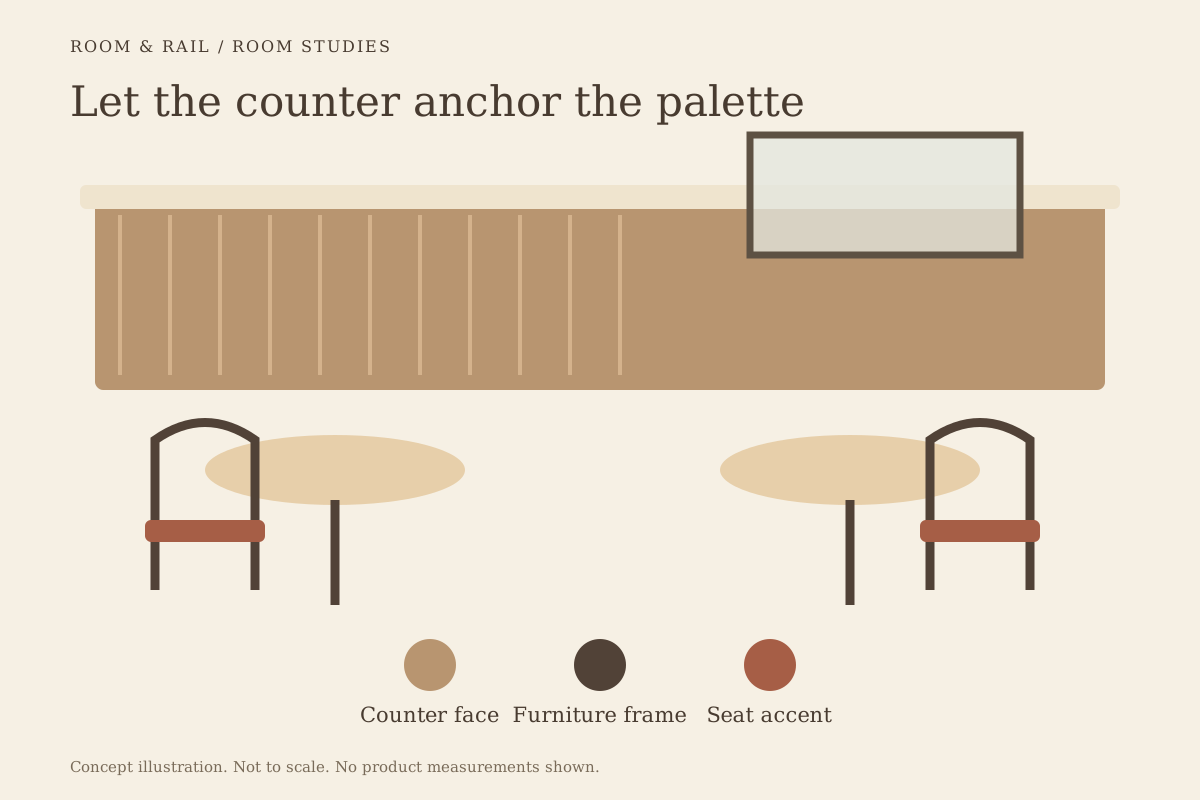
Open diagram at full size (new tab) ↗
Read the counter as a group of surfaces
Separate the counter front from the top and the background behind it. They may use different materials and have different prominence in the room. A dark counter face with a pale top creates another relationship from a single continuous light surface.
Place those references beside the cafe's dining chairs before considering decorative accessories. Decide which surface the chairs should relate to, if any. A repeated wood tone can make sense, but a shared curve or contrast can provide a connection without a close material match.
Use the materials guidance to keep the product descriptions accurate. A photographed wood-like finish does not identify the construction beneath it. The design note can describe a warm tone while the selected product retains its stated material and option name.
Choose how much the seating should announce itself
If the counter front is patterned or strongly colored, a simpler chair silhouette may make it easier to read. If the counter is visually quiet, the seating can introduce a more expressive shape. Compare both directions before treating the first appealing chair as the room's starting point.
Wood chairs and metal chairs can each take several visual roles. Material alone does not determine whether the piece feels restrained. The back opening, leg angle, and contrast between frame and seat also affect the outline.
Review the row of chairs nearest the counter rather than only one product image. Repetition may introduce more pattern than expected. The guide to open-back seating can help compare how much of the counter remains visible through the furniture.
Relate table edges to the counter line
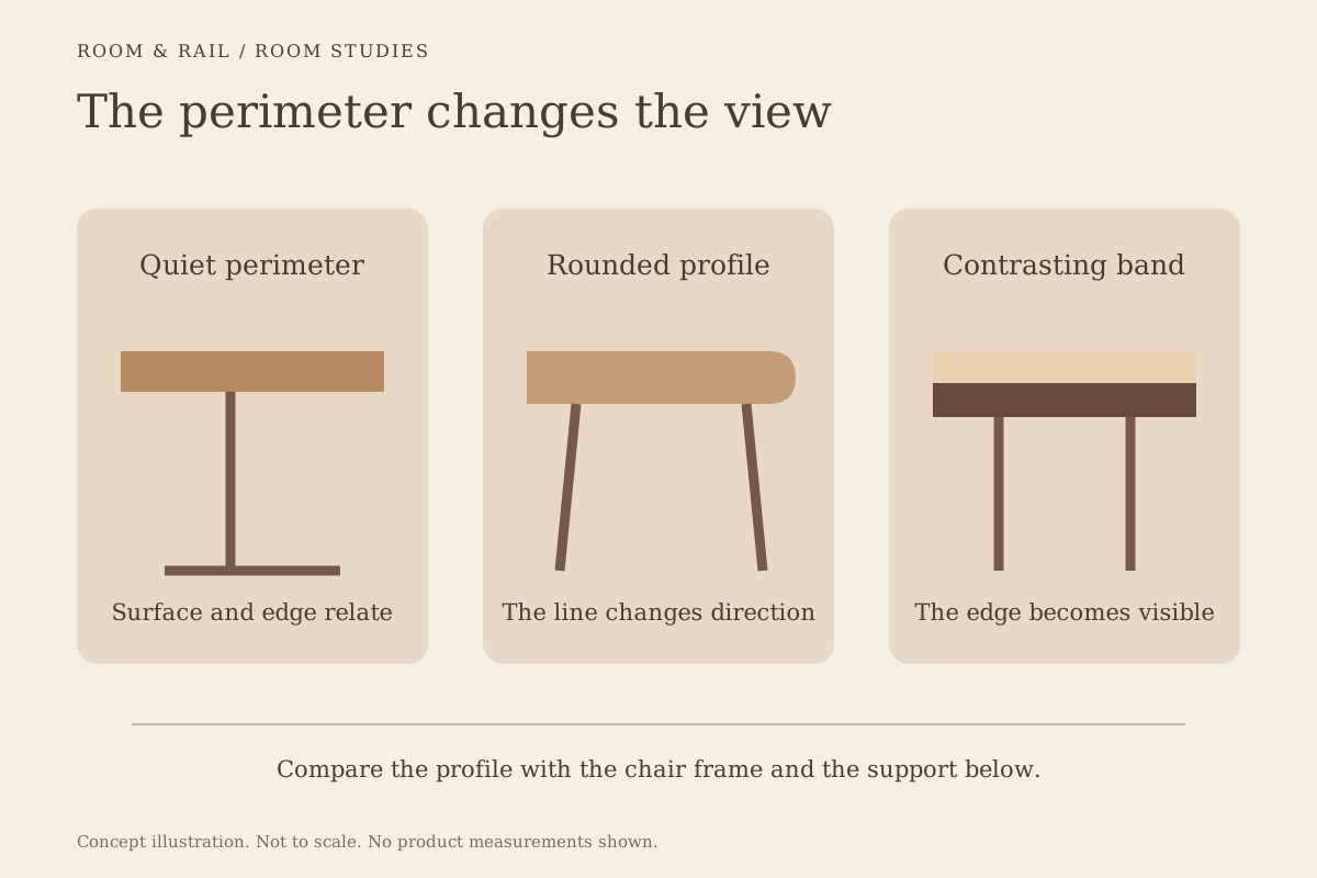
The countertop and the dining tables create horizontal lines at different heights. Their edge colors and visible depths can either connect or contrast. Consider that relationship from the entrance, where the tops may appear mainly as narrow bands.
Browse table surfaces with the counter reference beside them. A close color match is one option, but repeating only the lighter or darker part of the counter palette can be enough. Confirm the exact offered finish instead of using a generic color description in the saved board.
The restaurant table edge guide looks at this smaller detail. Check the table support as well. Where bases remain visible, they may connect more clearly to the counter's lower trim than the tabletop does to its upper surface.
Keep counter seating related but distinct
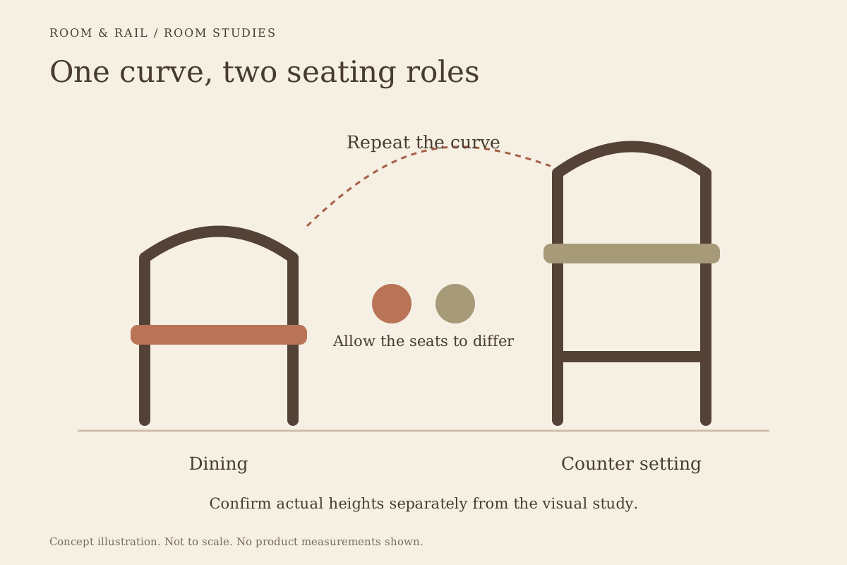
Some cafes include stools at a window or counter in addition to dining-height seats. Those stools can repeat a frame color or seat tone while using a different silhouette. The two seating types do not need to look identical to belong in the same room.
Review bar stools against the actual intended counter dimensions. The visual relationship is separate from the seat-height and fit questions. Keep missing measurements as confirmation items, especially when the catalog image makes the proportions look close.
The guide to connecting stools and dining chairs helps choose one shared detail. A restrained connection can leave the counter seating with its own character while keeping the overall furniture palette readable.
Include the display case without copying it
Display equipment may bring reflective surfaces, dark frames, or large areas of glazing into the scene. These details become part of the room whether or not they were chosen as decorative elements. Include the known equipment in the visual study.
Avoid trying to repeat every finish. A cafe with several equipment materials may benefit from a furniture palette that chooses one relationship and lets the rest remain background. A dark chair frame might relate to the display frame while a warmer seat connects to the counter face.
Study reflections and visibility in the actual room where possible. This is a visual review, not a claim about equipment performance or lighting requirements. Keep the equipment's operational needs with its own specification rather than trying to settle them through the furniture board.
Let the room's quieter areas remain useful
The furniture furthest from the counter may be seen against a different wall or window. A selection that supports the counter could need another comparison there. Walk through the intended seating positions before assuming the entrance view explains the whole cafe.
Use the sightline guide to identify the few views that matter most. A modest change in seat color or chair outline may resolve a relationship without introducing another unrelated furniture family.
Where the plan includes a bench or small lounge area, compare its larger surface with the loose seating. Give it a clear role, such as a quieter upholstered area beside more detailed chairs. The design should remain understandable even when the cafe is seen without table settings or accessories.
Build a board someone else can read
Create named groups in the finish board for the dining area and any counter seating. Save the chosen options on the actual product lines. Put the fixed counter references in the project notes or the wider design record so the reason for the furniture selection remains clear.
If a close physical match matters, record the sample comparison still needed. The finish-board guide explains why a selected thumbnail is a reference rather than a completed material approval. Keep alternatives separate from the version intended for review.
Bring the counter and seating into one conversation
Review the final selection from the entrance and from a seat facing the service area. Look for the specific connection you chose, then check whether any extra repeated detail adds confusion. A cafe can feel coherent with a small palette when each piece has a clear relationship to its surroundings.
Keep that relationship in a short written note as the furniture moves toward ordering. If the counter material changes later, revisit the affected chairs or tables rather than assuming the original match still holds. The board then remains a useful design record through revisions, instead of preserving a decision whose starting point has disappeared.