The room journal
Upholstered restaurant chairs as a quiet link between bold surfaces
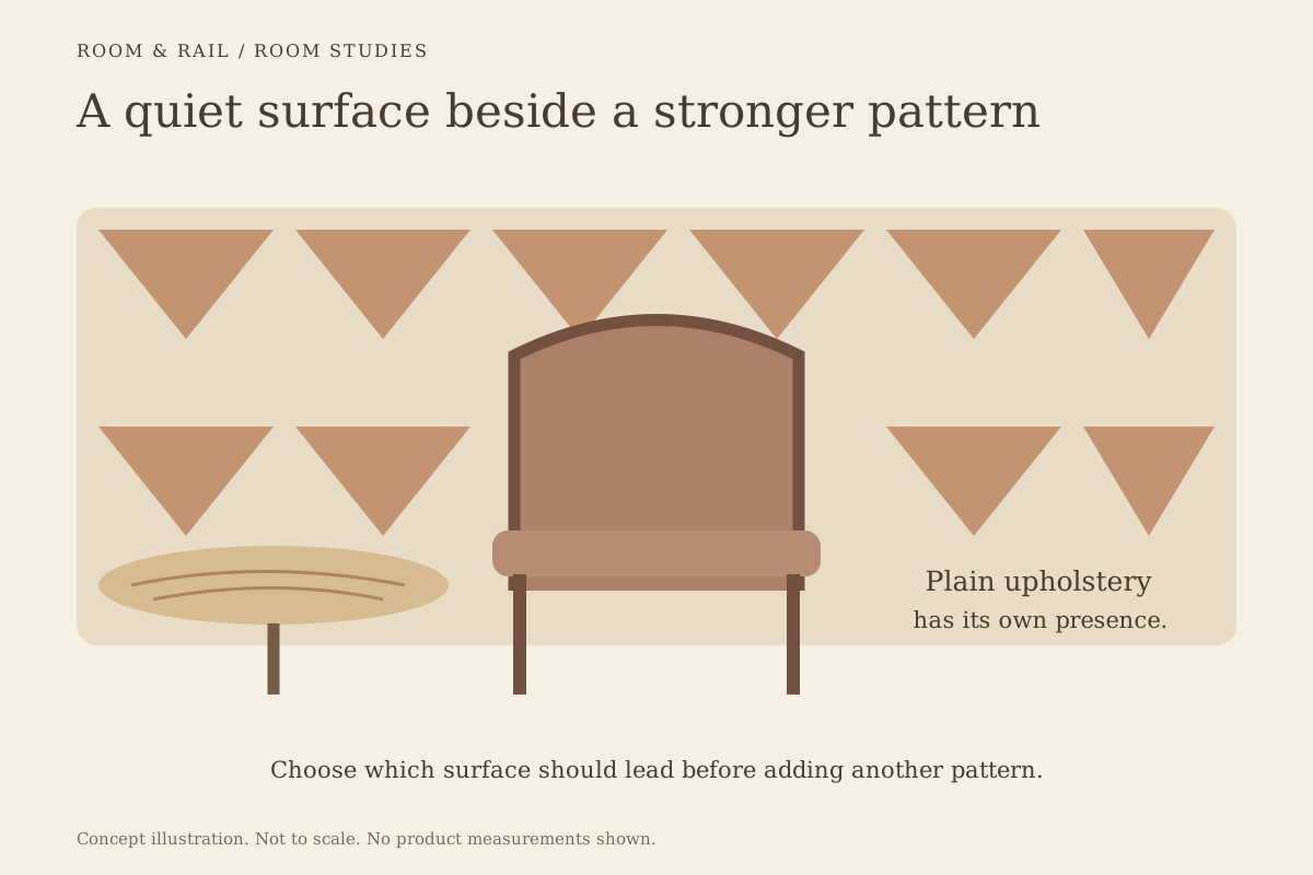
Upholstered restaurant chairs can provide a quieter surface beside a patterned wall, expressive tabletop, or strong floor design. The upholstery does not have to be colorless to do that work. Its value may come from a simpler area of color beside a more detailed material.
Decide which surface in the room should receive the most attention. Once that is clear, the chair can be selected for the way it supports the composition. A restrained seat beside a lively wall is a different decision from a richly colored chair intended to become the main feature itself.
Open diagram at full size (new tab) ↗
Identify the surface the chair will meet
Begin with the background nearest the seating. A patterned wall, tiled counter front, and figured tabletop each create a different relationship with upholstery. Place the actual reference beside the chair rather than using a general description such as bold interior.
Browse the restaurant chair collection for the available upholstered shapes and configurations. Look at how much of each model is upholstered. A seat pad contributes a smaller patch than a fully upholstered back, even if both use the same proposed color.
Keep that difference visible on the finish board. Equal-sized swatches can make materials seem equally prominent when they will occupy very different areas of the room. Review the whole-chair product image alongside the board so the material stays connected to its intended scale and shape.
Let the upholstery be calm without disappearing
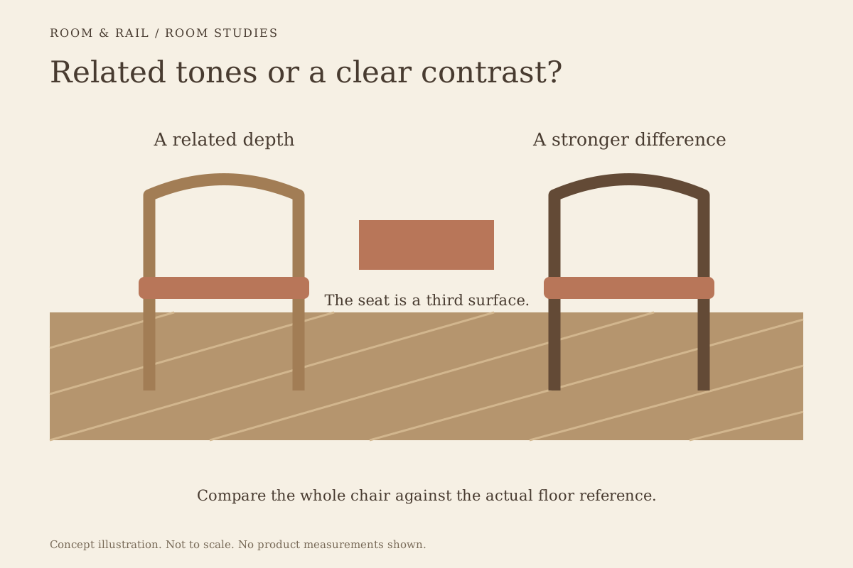
A plain surface can remain noticeable through its color and outline. It does not need a pattern to have a place in the composition. Compare a related tone from the surrounding materials with a clearer contrast and see which relationship is easier to read.
If the neighboring surface has several colors, resist pulling every one into the furniture. Choose a specific connection. The seat could relate to a quieter background color in the wall treatment while the chair frame remains a separate line.
The materials guidance helps distinguish color appearance from fabric or upholstery construction. Retain the stated option label and ask for any material information the project requires. A calm visual effect does not establish care requirements or performance.
Compare the upholstered back with the seat
The chair's back may be visible from the entrance while the seat is partly concealed by the table. A model with upholstery on both surfaces will therefore contribute differently from one with only a seat pad. Review the views that actually occur in the room.
The sightline guide explains how foreground chairs overlap tables and distant furniture. Use that layered view to decide where the quieter surface is needed. A seat-only reference may not address a visually busy background behind the chair back.
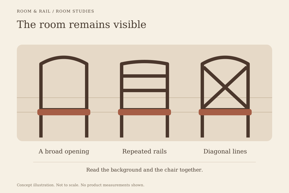
Consider an open-backed alternative as part of the comparison. The guide to open-back chairs shows how visible space between the frame can change the relationship. Neither more upholstery nor less upholstery is automatically the better answer.
Give the frame its own decision
A plain upholstered seat can sit within a detailed frame, so the whole chair may still introduce considerable visual activity. Look at the rails, legs, and junctions as well as the seat surface. The frame's contrast with the upholstery also changes the outline.
Compare wood chair frames with metal-frame alternatives where suitable options exist. Use the actual product record for construction and available finishes. Material categories provide a starting point, not a complete description of the model.
If the room needs a quieter chair, simplify the relationship that is causing the competition. That might mean a less contrasting frame, a plainer back, or a different seat color. Replacing every part of the selection at once can make it harder to understand which change helped.
Review the table surface as part of the pair
The chair will be seen close to its table. A highly figured tabletop can make a plain seat useful as a visual pause, while a quiet tabletop may leave room for a stronger upholstery color. Keep the two references together during the review.
Look at the edge as well as the top. The table edge guide shows how a contrasting perimeter can add another strong line beside the chair. A sample of the upper surface alone may leave that part of the pairing out.
Where the table and chair both carry detailed patterns, test a simpler alternative for one of them. The purpose is to make a conscious decision about their relationship. There is no need to remove every pattern, but each should have enough visual space to remain understandable.
Use larger upholstery surfaces as context
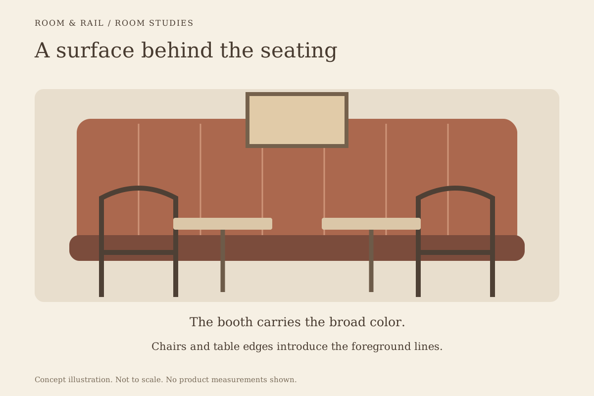
Nearby booth seating can introduce a much larger upholstered area than the loose chairs. Decide whether the chair should repeat that surface, contrast with it, or carry a related but distinct tone. An exact match is only one possible approach.
The guide to booth backs as room surfaces can help establish which upholstered element should lead. If the booth already forms a broad patterned background, simpler chair upholstery may leave that pattern more readable.
Check the relationship from both sides of the seating group. A chair facing the booth may look different when its back is seen against another wall. The same configuration needs to be considered in each of its prominent positions, rather than only in the most flattering view.
Confirm the actual selected reference
Review the exact upholstery option available for the chair before treating the palette as settled. Keep the selected thumbnail and label beside the model. A representative product photograph may show a different combination from the one saved on the line.
Use the finish-sample comparison guide when a physical approval is needed. Compare the reference with the actual neighboring materials and note the lighting conditions. A screen image is useful for organizing choices but leaves a close material relationship unresolved.
Leave the stronger surfaces room to speak
At the final review, identify what the chair is meant to support. If the wall or tabletop remains the main feature, the upholstery should help that relationship read clearly from the relevant views. A small color or frame change may be enough to settle the composition.
Save the chosen configuration with a short note about its role. That makes a later substitution easier to assess than an instruction to find a similar chair. The upholstery can then remain a deliberate part of the room's balance, even as individual products or surrounding finishes are revised.